Charpentier Sans Pro
IngoFonts · 1994
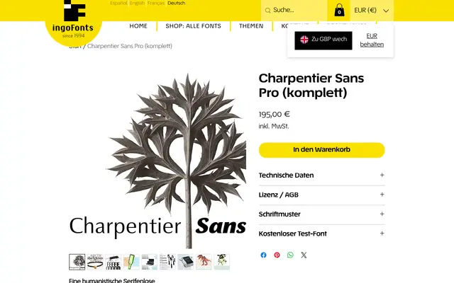
A humanist sans-serif with roots in Roman Capitalis lettering, developed originally in 1994 for the city of Graz's bid to host the 2006 Winter Olympics.
About
Stroke contrast drawn from medieval uncial scripts gives the typeface an unusual weight rhythm for a sans-serif, alternating between thick and thin strokes. Tiny pointed mini-serifs punctuate otherwise soft, flowing forms, sharpening the overall silhouette without sacrificing readability. The italic carries a more overtly calligraphic quality, with rounded forms on a, e, f, g and y recalling the humanistic cursive hand.
Classification
A humanist sans-serif derived directly from Roman Capitalis and humanistic manuscript writing, with stroke contrast inspired by medieval uncial scripts. The presence of tiny pointed mini-serifs and calligraphic pen-derived details place it firmly in the humanist sans tradition despite its serifless construction.