Charpentier Renaissance Pro
IngoFonts · Ingo Zimmermann
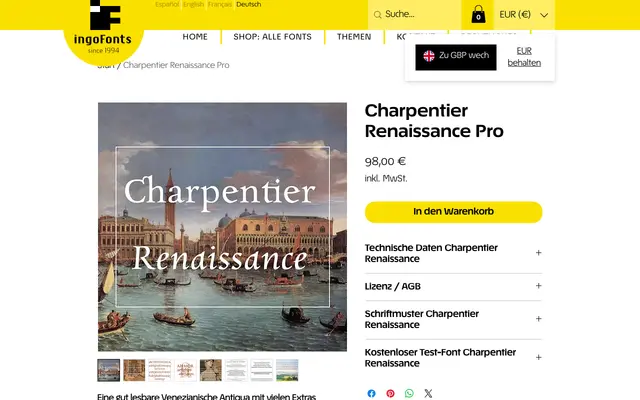
A broad-nib-driven Venetian serif inspired by the imperfect but lively letterforms of Aldus Manutius's 1499 Hypnerotomachia Poliphili type.
About
The design takes the early printed book as its model rather than the smoother, more regularised Renaissance antiquas that followed, preserving the hand-cut energy visible on the weakly inked pages of the Hypnerotomachia Poliphili. Softly curved serifs and a strong baseline give the roman a solid yet animated texture on the page. The accompanying italic, Charpentier Renaissance Italique, is drawn with almost no slant, following historical precedent, and is considered distinctive enough to stand as an independent face.
Classification
A Venetian (pre-Renaissance) serif rooted in early incunabula letterforms, specifically influenced by Aldus Manutius's type in the Hypnerotomachia Poliphili (1499). The design is governed by a broad-nib pen ductus with softly curved serifs and strong baseline presence, placing it firmly in the Venetian antiqua tradition.