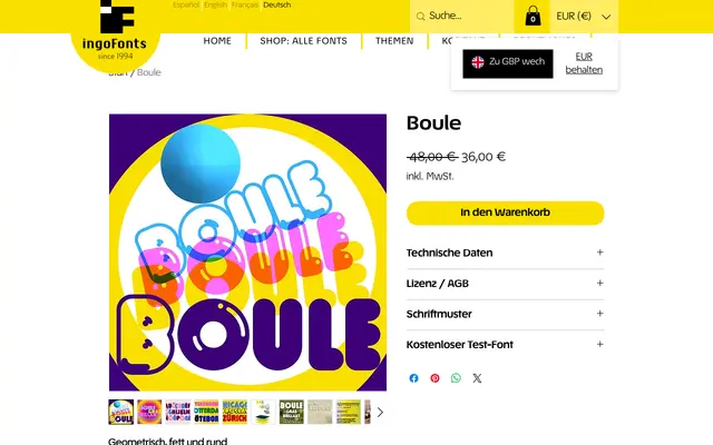
An all-caps monolinear display face built entirely from circular geometry, with uniform stroke widths, round terminals and three variants: standard, highlighted and outlined.
About
Every letterform in Boule is derived from the circle, with consistent stroke width throughout and rounded terminals sharing a uniform radius. The uppercase positions carry circular round letters, while the lowercase positions offer a narrower variant of the same alphabet. Ligatures for FT, ST, TT and TZ address spacing irregularities caused by the face's tight tracking, and two decorative sub-families – Brillant, with simulated highlights, and Contour, an outlined shadow variant – extend its application for three-dimensional effects.
Classification
A monolinear, all-caps geometric display face constructed entirely from circular forms and uniform stroke widths. Its extreme weight, tight spacing and rounded terminals place it firmly in the decorative/display category.