Auxerre
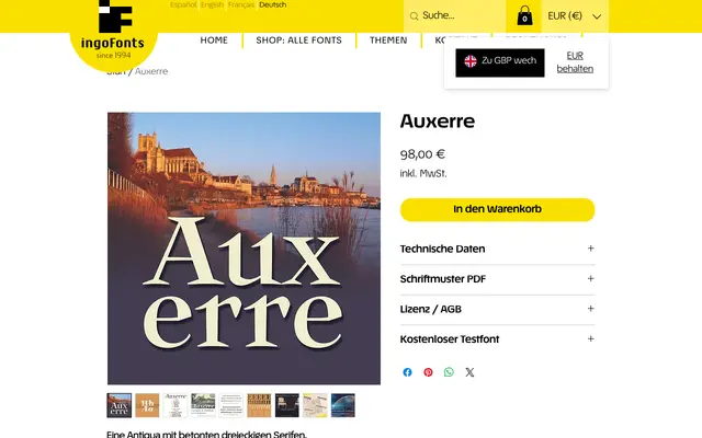
A display serif built around sharp triangular serifs and strong stroke contrast, imagined as an 18th-century French experimental cut anticipating the Etienne advertising faces of the following century.
About
Auxerre retains the letter proportions and underlying structure of Baroque roman type while departing sharply in its serif treatment, replacing traditional bracketed forms with angular, pointed triangles and hard-edged stroke joins. High contrast between thick and thin strokes is pushed further than Baroque convention, and the ductus introduces converging stroke edges and occasional breaks in inner curves. The result sits between Baroque and Neoclassical in spirit, closer in character to what would become the display Etienne category of 19th-century commercial typography.
Classification
A display serif with pronounced triangular serifs, high stroke contrast and angular transitions, described as a precursor to 19th-century advertising faces like Etienne – placing it between Baroque and Neoclassical traditions.