Analogue Pro
IngoFonts · Ingo Zimmermann
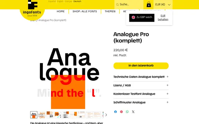
A reinterpretation of Akzidenz Grotesk with a distinctive l featuring a curved foot, 13° obliques and a suite of alternate letterforms, offered as a variable font.
About
Drawn from the tradition of Akzidenz Grotesk, Analogue Pro redraws all characters from the historical model with small but considered departures: angled M legs, an a that mirrors the curves of s, coordinated feet across a, l and t, and straight terminals on C, G and S. The obliques lean at a notably steep 13° and include a rounded e to further distinguish them from the upright. Multiple ligatures, proportional figures, oldstyle figures and tabular figures are included, alongside two OpenType style sets offering alternate letterforms.
Classification
A classical grotesque sans-serif rooted in the tradition of Akzidenz Grotesk, with humanist details such as a single-storey l with a curved foot, oblique stress and open apertures. The oblique cuts at 13° and alternate letterforms place it closer to humanist grotesque than pure neo-grotesque.