 MegaMegaTypeType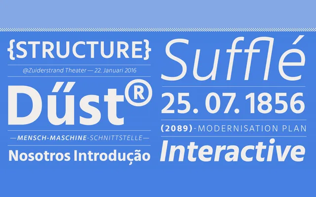
A humanist sans-serif designed for UI contexts, with low stroke contrast, open apertures and horizontal or vertical terminals across five weights with matching italics.
About
Mute was built around the demands of screen and interface design, prioritising legibility through low stroke contrast and terminals that terminate cleanly on the horizontal or vertical axis. Open apertures and compact counter forms keep characters distinct at small sizes. Five weights from Light to Bold each include an italic companion, with 386 glyphs per style covering a broad range of Latin-based languages.
Classification
A humanist sans-serif with low stroke contrast and horizontal or vertical terminals, giving it open apertures and clear counter forms suited to screen and UI use.
Weights
LightRegularMediumSemiboldBold
Languages
Latin
Tags
humanistuiscreenlow-contrastneutralversatilelegiblesans-serif