 MegaMegaTypeType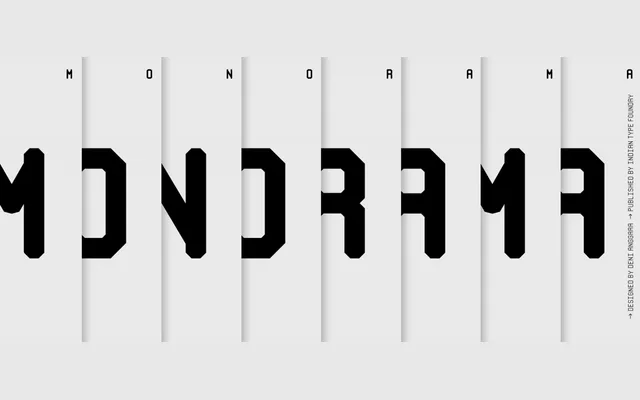
A caps-only display family by Deni Anggara built entirely from straight strokes, giving it a grid-constructed, industrial character suited to headlines and branding.
About
Every letterform in Monorama forgoes curves entirely: traditionally rounded glyphs such as 'C' and 'O' become straight-sided, while stroke endings are modulated to echo the feel of rounded or collegiate typefaces. The 'M' and 'W' share nearly identical forms rotated 180°, and the zero carries an internal slash to distinguish it from the 'O'. Despite appearing monospaced at first glance, the letters carry proportional widths, and each weight ships with two ampersand variants, directional arrows and a full set of fraction numerals.
Classification
A caps-only, proportional sans-serif display family with no curves whatsoever, constructed from straight strokes and modulated terminals. Its industrial, near-monospaced aesthetic places it firmly in the geometric display category.