 MegaMegaTypeType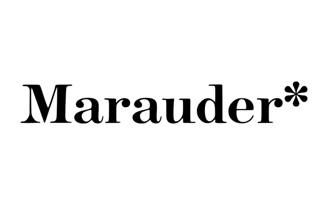
A free, open-source display typeface drawn from mid-century children's book lettering, packaging and cartoon title-cards, available in six weights, three optical sizes and matching italics across 36 styles.
About
Inspired by illustrators like Art Seiden and the frank, earnest typography of 1950s and 1960s children's media, Marauder* assembles hand-drawn warmth and mechanical charm into a coherent family. Three optical sizes shift proportions to maintain legibility at small sizes, while small caps and single-storey alternate forms for 'a' and 'g' deepen the mid-century flavour. Version 1.1 extended character coverage to over 250 languages, and the family ships with a variable font file.
Classification
A warmly drawn display typeface inspired by mid-century children's book lettering, hand-drawn title-cards and vintage food packaging. Its rounded, expressive forms and optical size system place it firmly in the casual display category, drawing on the mechanical warmth of hand-lettered commercial art from the 1950s and 1960s.