Alegreya
Huerta Tipográfica · Juan Pablo del Peral · 2011
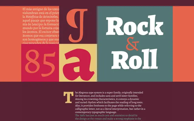
A humanist serif designed by Juan Pablo del Peral for extended literary reading, with expressive italics and calligraphic stroke modulation suited to body text.
About
Alegreya was conceived as a book typeface, with its letterforms carrying a calligraphic energy that keeps long passages of text alive on the page. The italic is particularly distinctive, departing noticeably from the roman to add expressive rhythm. Its coverage of Latin, Cyrillic and Greek makes it a capable choice for multilingual publishing.
Classification
Alegreya is a humanist serif with calligraphic warmth, designed for extended literary reading. Its dynamic stroke modulation, robust serifs and expressive italics draw on the tradition of book typography.