 MegaMegaTypeType
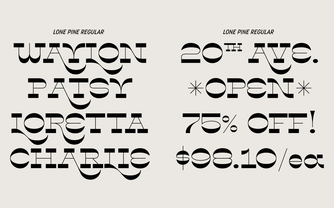
A reverse-contrast display serif inspired by the towns and desert landscape along California's Route 395, with prominent swashes and a style set for a 1970s sci-fi inflection.
About
Designed by Amy Hood and released in February 2020, Lone Pine draws on the western wood type tradition, using reverse contrast to give letterforms an immediate graphic punch. Big swashes amplify the display character, and an alternate style set shifts the mood towards 1970s science fiction lettering. Two weights – Regular and Bold – cover an extensive Latin language range.
Classification
A display serif with reverse contrast – strokes that are thinner vertically and heavier horizontally – rooted in western wood type traditions. High contrast and prominent swashes confirm its display-only character.