Intensiva
Graviton Font Foundry · Pablo Balcells · 2019
sans-serifhumanist sansitalic
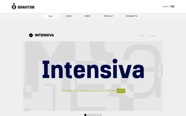
A slightly condensed humanist sans-serif with angular details and clipped terminals, available in four weights with matching italics and small caps.
About
Designed by Pablo Balcells in 2019, Intensiva pairs humanist proportions with angular detailing and shortened stroke endings that give it a distinctive, slightly unconventional edge. Its subtle condensation makes it particularly useful where horizontal space is at a premium without sacrificing readability. Each of the eight styles includes small caps and broad language coverage.
Classification
A slightly condensed humanist sans-serif with angular details and shortened terminals, giving it an unorthodox character while remaining functional for text use.
Weights
LightRegularBoldBlack
Languages
Latin
Tags
humanistcondensedangulartextspace-savingsans-serifmultilingual