Gubia
Graviton Font Foundry · Pablo Balcells · 2013
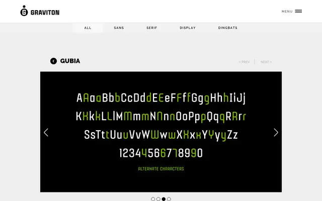
A slightly condensed geometric sans-serif in four weights, each paired with an alternate style offering a more playful character alongside a classic standard.
About
Designed by Pablo Balcells for Graviton Font Foundry, Gubia suits headlines of all sizes as well as short to medium text settings. The four weights ship with alternate companions and include small caps throughout, giving designers a choice between a restrained classical tone and something more expressive. Glyph coverage extends across several Latin-based languages.
Classification
A geometric sans-serif with slightly condensed proportions. The clean, structured letterforms follow geometric construction principles, with alternate styles offering a more playful character alongside the standard classic appearance.