Estricta
Graviton Font Foundry · Pablo Balcells · 2017
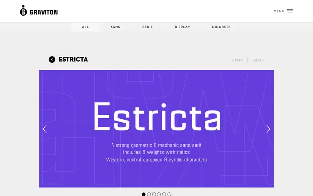
A geometric sans-serif with sharp, angular construction designed by Pablo Balcells in 2017, issued in 12 styles across six weights with italics and small caps throughout.
About
Estricta's strict, mechanical character comes from its angular edges and rigidly geometric forms, giving it a solid, technical presence. The family spans six weights from Thin to Black, each with a matching italic, and every style includes small caps. It is intended for short-to-medium text blocks as well as headlines at any size.
Classification
A geometric sans-serif with a mechanical, angular character. Sharp edges and strict construction place it firmly in the geometric sans tradition, with an industrial rigidity distinguishing it from humanist or grotesque approaches.