Electrónica
Graviton Font Foundry · Pablo Balcells · 2019
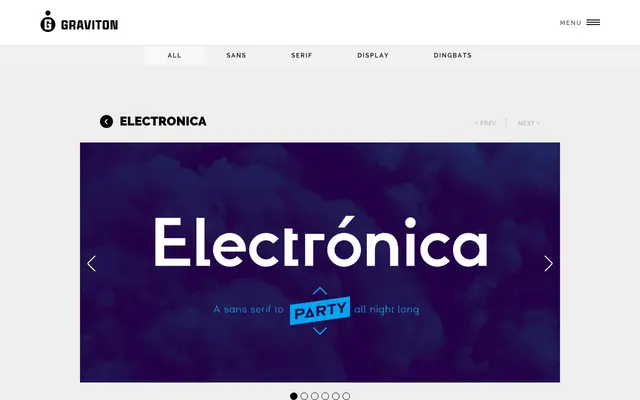
A rounded geometric sans-serif from Buenos Aires, designed for logos, headlines and short display copy with playful, sharp detailing across four weights and matching italics.
About
Electrónica pairs geometric structure with rounded terminals and sharp, lively forms suited to display work rather than extended reading. The family spans four weights from Light to Black, each with a corresponding italic, plus eight styles that include small caps and extended language coverage. Four styles are available free of charge.
Classification
A rounded geometric sans-serif with display-oriented detailing and playful, sharp forms. The combination of geometric structure and rounded terminals places it firmly in the geometric sans category with a display bias.