 MegaMegaTypeType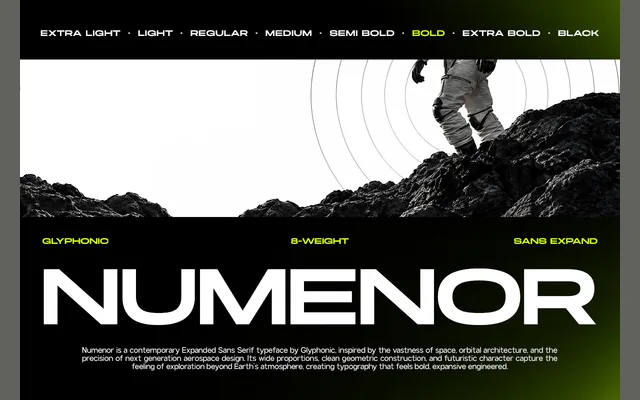
A contemporary expanded geometric sans in eight weights, built on wide proportions and clean construction with a futuristic visual character.
About
GC Nomenor is designed for display and headline use, with its wide proportions giving it a strong presence at large sizes. The geometric construction and consistent stroke weight lend it a tech-oriented, forward-looking quality. Eight weights from Extra Light to Black make it adaptable across both light and heavy typographic contexts.
Classification
A wide, expanded geometric sans serif with clean construction and a futuristic character, consistent with the geometric sans subcategory due to its reliance on geometric forms and even stroke weight.
Weights
Extra LightLightRegularMediumSemi BoldBoldExtra BoldBlack
Languages
Latin
Tags
geometricsans-serifexpandedfuturisticdisplayheadlinetechwide