 MegaMegaTypeType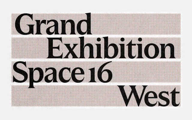
A pointed display serif by Marcus Gärde, Anders Wikström and Paola Alonso Chapel, drawing on 19th-century European tradition with ink traps, even stroke contrast and a dedicated text subfamily.
About
GD Bauer takes its proportions and pointed serifs from the pan-European typefaces that circulated between Paris and Berlin in the 1800s, then updates them with ink traps designed to catch the light at large sizes. Even stroke contrast keeps the design from tipping into pure historicism. A separate text subfamily in four weights carries the same character down to body copy, making it genuinely useful across a range of sizes.
Classification
A pointed, high-contrast display serif rooted in 19th-century European tradition, with ink traps and harmonised proportions. The even stroke contrast places it closer to a refined display serif than a strict neoclassical or didone, bridging historical reference and contemporary legibility.