District
GarageFonts · Phil's Fonts
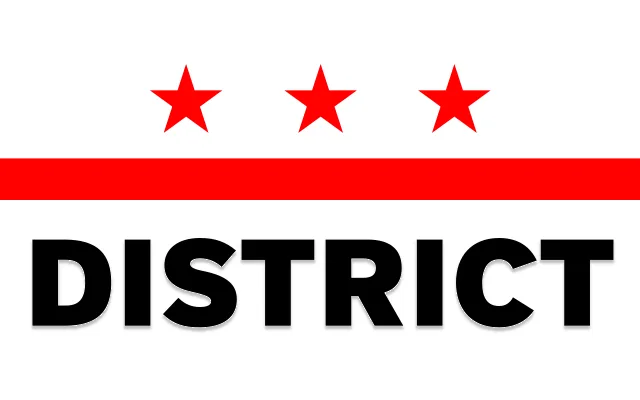
A spare, utilitarian grotesque in seven weights with matching italics, designed in the suburbs of Washington DC with a quiet 1990s character.
About
District keeps its personality firmly in check, offering clean grotesque forms across a range from Thin to Black. The 14-style family pairs each upright weight with an italic, giving it enough range for editorial and identity work. The foundry describes it as having a hint of 1990s flair, which manifests in its restrained, slightly cool letterforms rather than any overt stylistic gesture.
Classification
A clean grotesque with restrained, utilitarian letterforms and a subtle 1990s aesthetic sensibility, placing it firmly in the lineal grotesque tradition without geometric or humanist tendencies.