 MegaMegaTypeType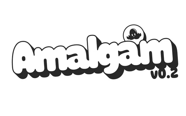
A bubbly rounded sans whose heavy weights squash their letters into each other.
About
Amalgam began with the Greek, drawn from the top-heavy lettering on a 1946 sheet-music cover, and the Latin follows its lead. In the heavier weights the letters overlap on purpose, and contextual alternates open or close the gaps to keep the colour even. A second axis runs from tight to loose spacing.
Classification
Sold as an in-progress release on Future Fonts (v0.2). Started from Greek lettering on a 1946 sheet-music cover; letters collide and overlap in the heavy weights, helped by contextual alternates. Variable weight plus a tight-to-loose spacing axis.
Family
Amalgam VF
Languages
LatinGreek
Tags
roundedbubblyoverlappinggreekplayfulvariablepostersdisplay