 MegaMegaTypeType
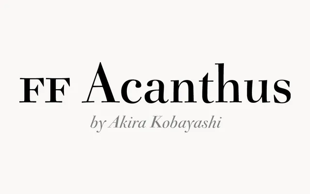
Akira Kobayashi's Scotch Roman-flavoured serif, drawn for FontFont between 1998 and 2000 with separate text and display cuts.
About
FF Acanthus takes the high-contrast, ball-terminal look of 19th-century Scotch types and gives it a cleaner finish. The Text version is sturdier for small sizes, while the Open roman and italic add an inline for titles. A good fit for books, magazines and invitations that want a classic voice with some sparkle.
Classification
Serif in the Scotch Roman tradition with crisp contrast and ball terminals, drawn by Akira Kobayashi between 1998 and 2000. A sturdier Text version handles reading sizes and an Open cut with an inline adds a titling option.
Weights
RegularBold
Optical sizes and widths
Text
Family
FF Acanthus TextFF Acanthus Open
Languages
Latin
Tags
serifscotch romandidoneeditorialbookeleganttitling