 MegaMegaTypeType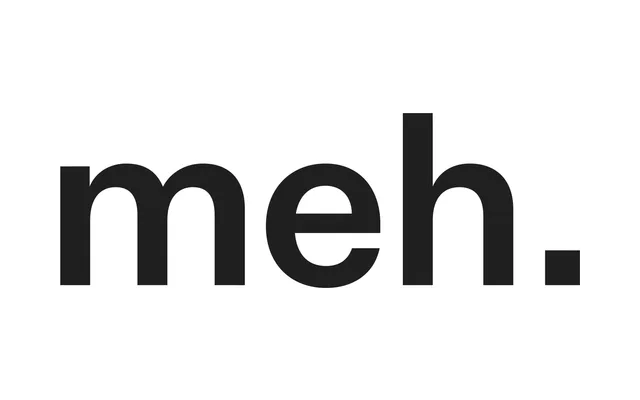
Kris Sowersby's 2017 grotesque designed with the deliberate intent of being unrecognisable, stripping familiar genre conventions back to a skeletal, baggage-free utility.
About
Where most grotesques carry recognisable personality — the distinctive 'a' of Helvetica, the sliced stems of Arial — Untitled Sans methodically removes such markers to produce a typeface that simply does its job. The 90-degree terminals, widened apertures and restrained spur on the 'a' nudge it closer to Akzidenz Grotesk than to its more cheerful sibling Calibre, whilst remaining deliberately harder to place. Its neutrality makes it particularly effective when type is meant to carry a functional or narrator-like voice rather than a stylistic one.
Classification
A grotesque sans-serif conceived deliberately to avoid stylistic distinction, drawing on the Akzidenz Grotesk and Helvetica tradition whilst stripping back defining quirks such as the teardrop 'a' pinch and angled terminals.