Highway Fonts
Font Review Journal · Various · 1948
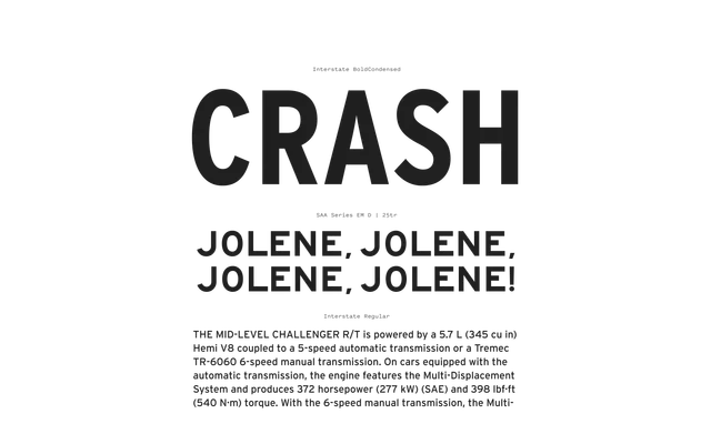
A genre review of US Highway Gothic and its derivatives, tracing the family of low-contrast, wide-aperture sans-serifs standardised by the Federal Government in the 1940s and widely revived for use far beyond road signage.
About
Originally drawn in multiple series widths (A through F) to maximise legibility on traffic signs at speed, Highway Gothic established a set of distinctive letterform traits: raised bowl proportions, spurless G, wide open apertures and idiosyncratic numerals. Decades of revivals range from Tobias Frere-Jones's polished Interstate to more faithful reconstructions such as Roadway, each interpreting the source material's eccentricities differently. Their ubiquity in American visual culture and the variety of weights and widths available have helped them migrate into editorial, branding and packaging design.
Classification
US Highway Gothic and its derivatives are low-contrast, wide-aperture sans-serifs with geometric simplicity and functional origins in American traffic signage, placing them firmly within the grotesque/gothic sans tradition.