 MegaMegaTypeType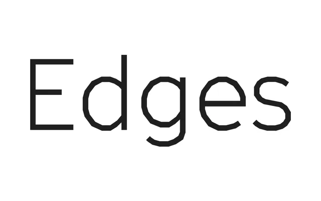
A sans-serif built entirely from straight lines, derived from the subtitle-burning Cinetype machine used in Swiss film production, distributed by Grilli Type.
About
Every character in GT Cinetype is constructed without a single curve, yet the design avoids feeling mechanical or constrained – the letterforms read as natural and cohesive across body and display sizes. The family includes a monospace variant with narrower proportions and slab serifs on key characters, suited to technical or motion contexts. Its cinematic origins make it particularly well suited to reversed-out settings, film-grain aesthetics and large-scale environmental applications.
Classification
A geometric sans-serif constructed entirely from straight lines and angles, inspired by the bitmap-like characters burned into film by the Swiss Cinetype machine. Its rectilinear construction places it firmly in geometric territory, though its quirky details and cinematic heritage give it a distinctive industrial character.