 MegaMegaTypeType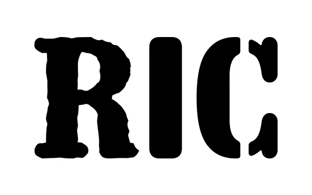
A compact, all-caps display family from Barcelona's Fonts From Folch, released across four colour-coded styles with at least one variant intended for physical stencil use.
About
RIC is a compact, uppercase-only display typeface built in four distinct styles, each assigned a colour in FOLCH's marketing materials. The family is designed to function in real-world contexts as well as on screen — a physical stencil template exists for at least one style, pointing to use in signage and environmental graphics. It follows FOLCH's pattern of typefaces with strong design intent and cultural grounding rather than generic utility.
Classification
Compact, all-caps display family in four styles, each colour-coded in FOLCH's brand materials (blue, brown, green, purple). Described on Instagram as "a compact all-caps, four-style family." At least one style variant has an associated physical stencil template ("Made for the real world"), pointing toward signage and wayfinding applications. The four styles appear to be designated alphabetically — the physical template post references "FFF RIC (A)." Compact proportions and uppercase-only orientation place this firmly in display territory. Whether letterforms carry any serif detail is unconfirmed; given FOLCH's history with sans-serif work (Acid Grotesk, Good Direction Sans), a sans-serif classification is the most probable reading.