 MegaMegaTypeType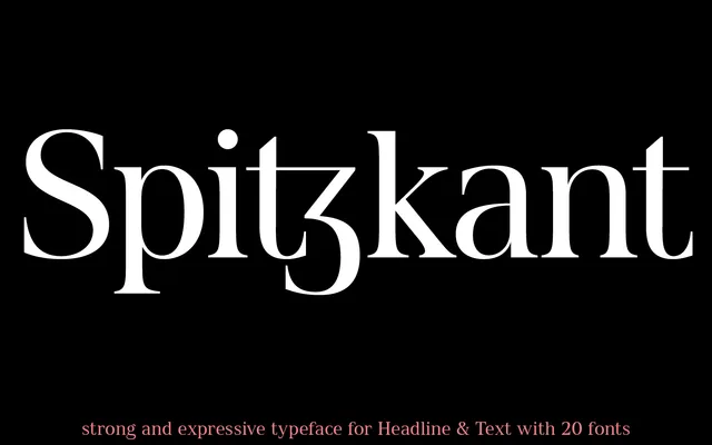
A two-subfamily sans-serif offered in Head and Text optical cuts, spanning five weights with obliques and a broad set of OpenType features including small capitals, oldstyle figures and stylistic alternates.
About
Spitzkant is structured around two purpose-specific subfamilies: Head for display use and Text for body setting, each sharing the same five-weight range from Thin to Bold with corresponding obliques. OpenType features include small capitals, case-sensitive forms, lining and oldstyle figures, proportional and tabular figures, fractions, and multiple stylistic alternates for characters such as K, W, A, V and the lowercase a. The German name — meaning 'sharp edge' — hints at a crisp, precise character to the letterforms.
Classification
A sans-serif family with two optical subfamilies — Head and Text — suggesting a geometric or rational design intended for both display and body use. The presence of obliques rather than true italics is consistent with geometric sans conventions.