 MegaMegaTypeType
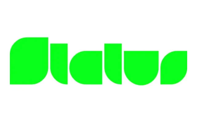
A single-weight display face that pairs super-heavy uppercase letterforms with ultra-light numerals and special characters for a deliberately jarring weight contrast.
About
The design's central conceit is the clash between its super-heavy alphabet and the comparatively skeletal figures and punctuation, creating a visual tension that makes it unsuitable for body text but attention-grabbing at display sizes. With only a Regular cut, its appeal is narrow but deliberate. The extensive Latin language coverage suggests a serious infrastructure behind an otherwise irreverent design.
Classification
A novelty display typeface with deliberately mismatched weight contrasts between uppercase letters and numerals/special glyphs, making it unsuitable for running text and squarely a display or titling design.