Tipografia Natura
Fabio Haag · Fabio Haag, Henrique Beier, Ana Laydner, Eduilson Coan, Sofia Mohr, Luciana Haag
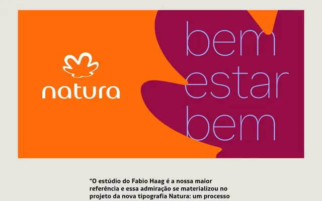
A bespoke 40-font corporate typeface for Natura, built on a neutral sans-serif structure and softened with calligraphic terminals and rounded punctuation across three optical sizes from Display to Micro.
About
Designed for the Brazilian cosmetics brand Natura, the typeface evolves an existing sans-serif identity rather than replacing it, introducing subtle warmth through calligraphic terminals on a, c, e and s, and rounding the dots of i and j and punctuation marks. Three optical variants — Display, Text and Micro — ensure legibility across every context, from large-format brand campaigns to small-scale product labelling. The full system spans 40 fonts across weights from Hairline to Black, developed in collaboration with studio Ana Couto.
Classification
A conventional sans-serif structure with subtle calligraphic warmth introduced at terminals and punctuation, placing it firmly in the humanist sans category despite its underlying neutrality and legibility focus.