 MegaMegaTypeType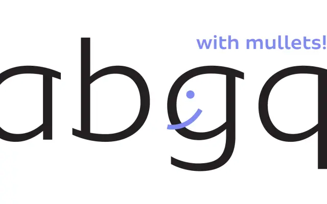
A slightly wide humanist sans with curves that extend beyond the stems, designed by Fabio Haag for display and headline use across 208 Latin-based languages.
About
Released in 2017, Sua's distinguishing detail is the way its curves extend past the stems, lending the letterforms an expressive, almost calligraphic warmth at larger sizes. Clean underlying shapes keep it functional in short passages of text. Seven weights, from Thin to Black, are offered in a single upright style.
Classification
A humanist sans with slightly wide proportions and distinctive curves that extend beyond the stems, giving it a warm, calligraphic quality suited to display use while remaining legible at text sizes.
Weights
ThinLightRegularMediumBoldXBoldBlack
Languages
Latin
Tags
humanistdisplayheadlinewidelegiblelatincalligraphicwarm