Netshoes Ritmo
Fabio Haag · Eduilson Coan, Fabio Haag
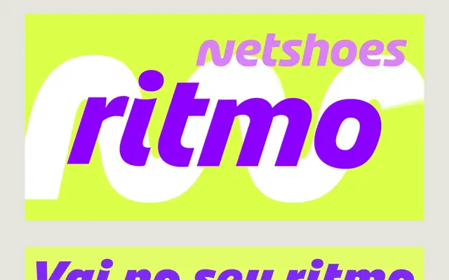
A 28-style bespoke corporate family designed for Brazilian sportswear e-commerce brand Netshoes, with italic angles and letterform construction that shift between expressive display and legible text settings.
About
Designed over six months in collaboration with Netshoes and FutureBrand, the family adapts its character across optical contexts: at display sizes, italics lean at an exaggerated angle and the O and S are rotationally constructed for visual dynamism, while heavier weights add a curved apex to the i and j dots. At text sizes, the italic angle normalises and letterforms are rationalised for readability. The S throughout the family is derived directly from the Netshoes logo, creating measurable brand consistency.
Classification
A bespoke corporate sans-serif with humanist construction, featuring variable italic angles across optical sizes and rotated O and S letterforms inspired by the Netshoes logo. The dual-axis design separates expressive display behaviour from text-optimised legibility.