Itaú
Fabio Haag · Fabio Haag, Henrique Beier, Ana Laydner, Eduilson Coan · 2023
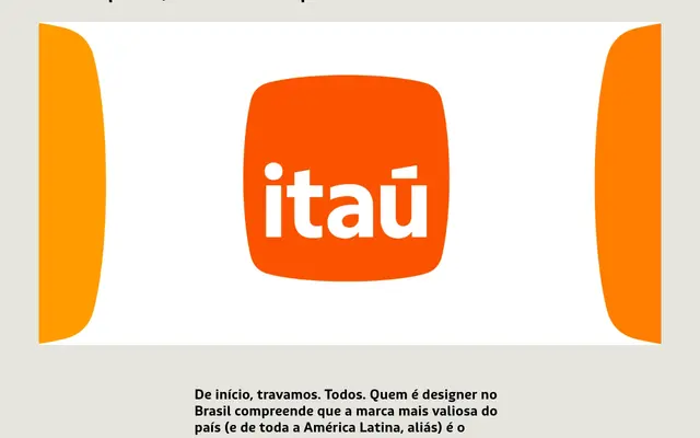
A bespoke humanist sans-serif wordmark developed for Brazil's most valuable brand, refined in collaboration with Pentagram New York for Itaú's 2023 identity overhaul.
About
The design retains the humanist sans structure of the previous logotype, with subtle stroke contrast, open terminals on the 'a' and 't', and a newly widened 't' for improved legibility at small sizes. A distinctive horizontal accent replaces the conventional vertical construction, and the initial capital is dropped in favour of a fully lowercase setting. A separate variant for Itaú BBA incorporates curved tops drawn from the new symbol, extending the identity system across the brand family.
Classification
Described explicitly as a humanist sans-serif, showing influence of calligraphic hand with subtle stroke contrast and open terminals, consistent with the humanist sans tradition.