Chiquinho
Fabio Haag · Sofia Mohr, Henrique Beier, Ana Laydner, Eduilson Coan, Luciana Haag, Fabio Haag
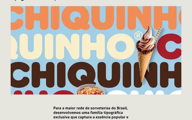
A bespoke 18-style family designed for Chiquinho Sorvetes, Brazil's largest ice cream chain, with cream-tipped terminals that carry the product's texture into the letterforms themselves.
About
Built across 9 weights in two optical subfamilies — Títulos for display use and Textos for legibility at small sizes — the family's defining detail is the contrast between softly rounded upper curve endings and pointed, cream-like lower tapers, a motif carried through to accents and punctuation. The double-storey 'g' is a particular focal point, and the Textos subfamily includes subtle alternate letterforms to improve readability in demanding contexts. The design ties the brand's popular, accessible identity to a contemporary and functional typographic system.
Classification
A custom humanist sans designed for a Brazilian ice cream chain, with organic, rounded terminals on upper curves and pointed, cream-like tapers on lower curves. The dual-style family (Títulos and Textos) and warm, approachable letterforms place it firmly in the humanist sans tradition.