Air India
Fabio Haag · Fabio Haag, Eduilson Coan, Henrique Beier, Ana Laydner
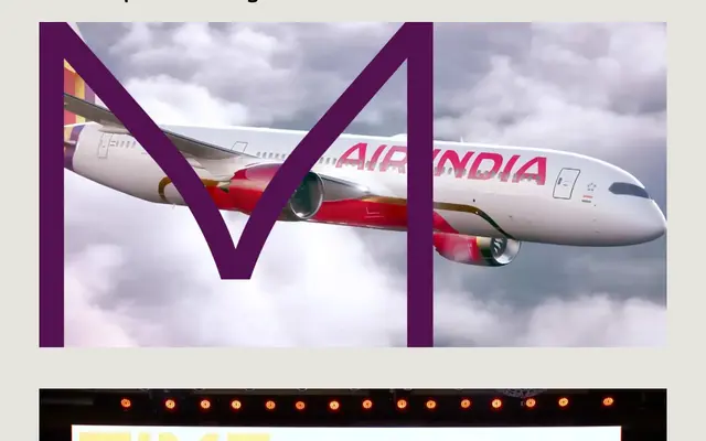
A bespoke extended geometric sans created for Air India's rebrand, blending wide square-oval letterforms with calligraphic details and motifs drawn from Indian architectural heritage.
About
Designed collaboratively across Brazil, London, France and India for FutureBrand, the typeface pairs broad horizontal proportions and rounded letterforms with culturally specific details: a distinctive curve where diagonals meet in letters such as 'M' and 'W', echoing the iconic arched windows of Indian architecture. Subtle calligraphic movements in strokes of 'T' and 'J' lend authenticity without sacrificing legibility at scale. The result gives Air India a proprietary typographic voice that remains instantly recognisable without accompanying graphic marks.
Classification
A custom extended geometric sans-serif with wide horizontal proportions and rounded square letterforms, drawing on Indian calligraphic and architectural motifs for a globally legible corporate identity typeface.