 MegaMegaTypeType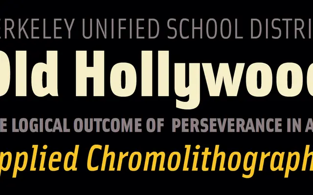
A humanist sans-serif in four weights with italics, designed by Zuzana Licko in 2000 for Emigre.
About
Designed by Zuzana Licko, Solex sits within the humanist sans-serif tradition while retaining the experimental sensibility associated with Emigre's output. The family spans four weights — Regular, Medium, Bold and Black — each with a matching italic, totalling eight styles. It functions as a capable text face while carrying the distinctive personality of Licko's letterform decisions.
Classification
Solex is a humanist sans-serif with idiosyncratic letterform details characteristic of Licko's digital-era work at Emigre, blending legibility-focused construction with distinctive quirks that resist easy genre classification.
Weights
RegularMediumBoldBlack
Languages
Latin
Tags
humanistsans-serifemigrelickodigitaleditorialtextlegible