 MegaMegaTypeType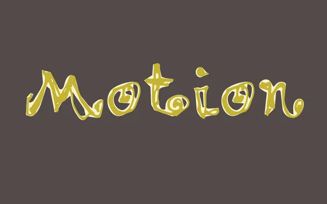
A two-weight display typeface designed by Frank Heine in 1992 for Emigre, reflecting the experimental digital typography of that era.
About
Released during Emigre's most creatively fertile period, Motion sits within the foundry's tradition of questioning typographic convention through digital means. Available in Light and Bold, the family is modest in scope but distinctive in character. Its name suggests an interest in dynamism and visual energy, qualities common to the deconstructivist design culture of early 1990s California.
Classification
An experimental display typeface from the early digital era, characteristic of Emigre's 1990s output. Its name and design suggest an interest in kinetic or distorted letterforms typical of the deconstructivist typographic movement of the period.