 MegaMegaTypeType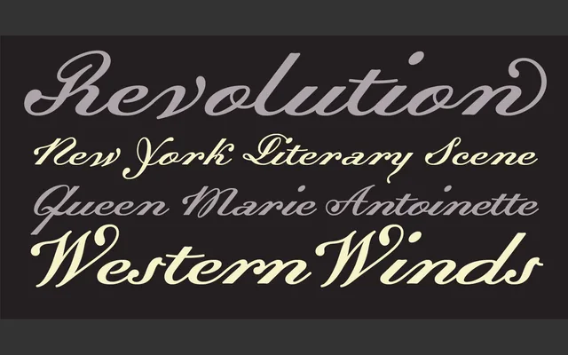
Frank Heine's year-2000 family for Emigre pairs a refined historical Roman with a calligraphic Script and a set of ornamental Flourishes for formal display work.
About
Dalliance comprises four distinct components: a Roman, two Script variants (one optimised for display scale), and a Flourishes font of decorative ornaments. The family draws on historical calligraphic and engraving traditions, giving it a formal, refined character suited to editorial headers, invitations and luxury branding. The Flourishes font extends the family's decorative potential well beyond what a standard glyph set would allow.
Classification
Dalliance combines a refined Roman with an expressive Script and ornamental Flourishes, placing it firmly in the display category. The Roman draws on historical serif forms while the Script and decorative companions push it towards formal, calligraphic display use.