Bask
Dotless type · Jan Kranjec
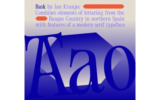
A contemporary serif by Jan Kranjec that draws on Basque lettering, inverting conventional stroke contrast so that horizontals are lighter and verticals bolder.
About
Bask reverses the expected contrast logic of most serif typefaces, making the horizontal strokes the thinner element while verticals and diagonals carry the weight. The inspiration from Basque lettering gives the design a regional folk-calligraphic character that sits alongside an otherwise contemporary construction. The result is a typeface with a distinctive tension between tradition and idiosyncrasy, suited to display use and editorial work where a subtly unusual voice is needed.
Classification
A serif with inverted contrast — lighter horizontals and bolder verticals and diagonals — drawing on Basque lettering traditions to produce an unconventional stroke relationship within a broadly contemporary serif structure.