 MegaMegaTypeType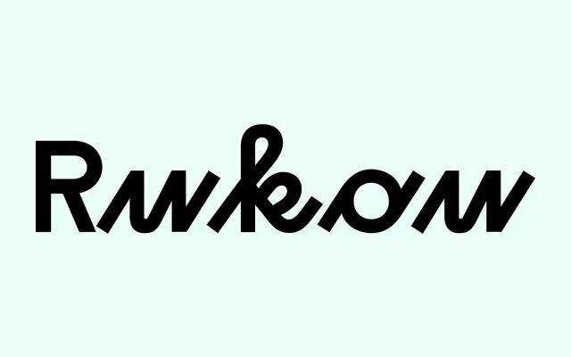
A geometric-script hybrid born from a fashion logo commission, drawing on schoolhand models to create a distinctive disconnected lowercase with two stylistically distinct registers within a single font.
About
Rukou began as a logo typeface for a fashion designer, aiming to merge geometric construction with a childlike, hand-derived sensibility. The lowercase is intentionally disconnected, a deliberate choice that unlocks more expressive individual letterforms at the expense of conventional readability. Uppercase and lowercase occupy distinct textural territories within the same font, allowing typographers to contrast the two registers for title and paragraph setting.
Classification
Classified as display due to its primary focus on texture and visual character over readability. The typeface fuses geometric construction with schoolhand-derived letterforms, creating a half-script hybrid with disconnected lowercase that prioritises personality over legibility at text sizes.