Rainha da Pérsia
Cyla Costa Studio · Aline Kaori
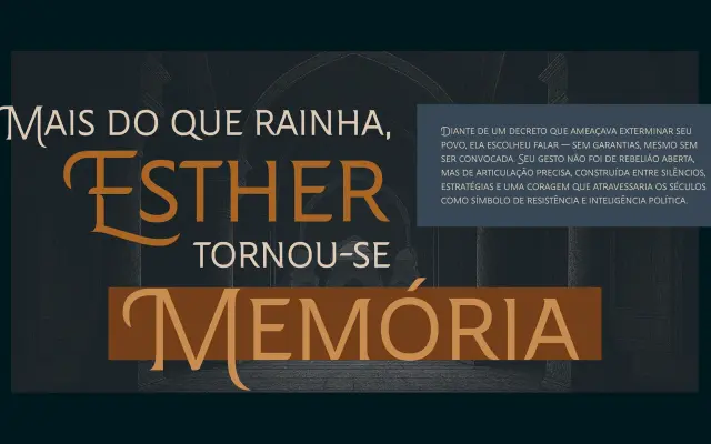
A custom display typeface designed for Brazilian telenovela Rainha da Pérsia, combining flared serifs, small caps structure and ornamental swashed initials drawn from ancient calligraphic traditions.
About
Commissioned by Record TV for use across all promotional materials and the production's opening and closing credits, the typeface required both visual impact and consistency across platforms. Its low-contrast letterforms are built on a small caps structure, with asymmetrical flare serifs lending an epic, dramatic quality suited to the production's historical setting. Ornamental swashed initials draw on the calligraphy of ancient texts, reinforcing the period atmosphere.
Classification
A display serif with low stroke contrast, small caps structure and asymmetrical flare serifs, designed for dramatic headline use in a telenovela production. The ornamental swashed initials and calligraphic inspiration place it firmly in the display category rather than a conventional text serif.