Lua Display & Text
Cyla Costa Studio · Cyla Costa, Aline Kaori
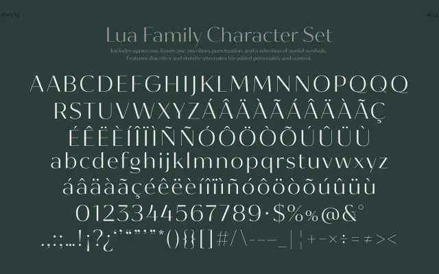
A variable sans-serif with weight and contrast axes, created as a custom typeface for Brazilian brand Luz da Lua, offered in separate Display and Text configurations.
About
Designed to serve a rebranded fashion or lifestyle label, Lua pairs high contrast with restrained detailing across two optical variants. The variable font format drives both weight and contrast through a single file, giving the client flexibility from fine product tags to large storefront applications. Creative direction and type design were handled by Cyla Costa alongside Aline Kaori.
Classification
A high-contrast sans-serif with variable weight and contrast axes, designed to sit between display and text applications. The contrasted construction with clean detailing places it closer to a refined contrast sans rather than a traditional grotesque or humanist.