Kopp Display
Cyla Costa Studio · Cyla Costa, Aline Kaori
displaygeometric sans
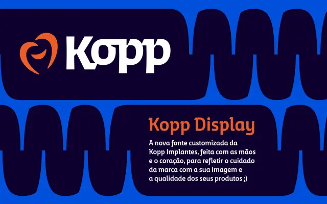
A bespoke bold display sans-serif created for Brazilian dental implant company Kopp, defined by sharp angular stroke terminals and a precise, technical character.
About
Designed as part of a full rebrand for Kopp Implantes, the typeface draws its formal language from the precision and exactness of the dental implant sector. Entry and exit strokes carry sharp angles and clean cuts that reinforce a sense of technical rigour. Available for licensing on enquiry, it sits within a wider graphic identity system built to project authority and clarity.
Classification
A bold display sans-serif with sharp entry and exit strokes and clean angular cuts, designed for high-impact brand communication rather than extended text setting.
Weights
Bold
Languages
Latin
Tags
displaycustombrandboldgeometricsharpangularcorporate