ArtRio
Cyla Costa Studio · Cyla Costa, Aline Kaori
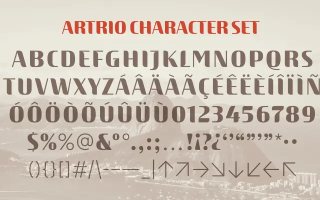
A custom display typeface developed for ArtRio's 15th anniversary, extending the fair's iconic high-contrast R into a full typographic system.
About
Commissioned by ArtRio via Dupla Design, the typeface grows from the curvy, high-contrast geometry of the fair's established logo mark. The design resolves inconsistencies in the original logo while preserving its visual character, resulting in a vibrant type system intended for consistent use across the fair's communications. Creative direction and type design were led by Cyla Costa, with Aline Kaori handling design and font production.
Classification
A custom display typeface with high contrast and curvy forms derived from the ArtRio fair's iconic logo R. Classified as display due to its expressive, decorative character rather than text utility.