 MegaMegaTypeType
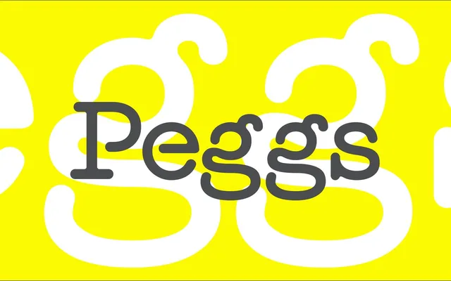
A four-weight family originally drawn for a Brighton fashion retailer, built on the visual language of monospaced typewriter fonts and the accidental ink artefacts of early print processes.
About
First created as a single bold weight for the identity of Peggs & son., a retail fashion shop in Brighton, the family was later fully redrawn and extended across four weights with extensive OpenType features. Its character comes from deliberate imperfection: strokes that don't quite meet and pooled ink at connections, lifted directly from the unintentional effects of under- and over-inking on historical typewriter faces. The result sits between functional monospace and expressive display type.
Classification
Rooted in monospaced typewriter fonts, Peggs draws on the incidental artefacts of early printing processes – ink pooling and unjoined strokes – making these imperfections a defining structural feature rather than a novelty.