 MegaMegaTypeType
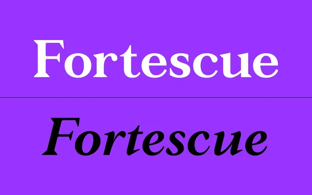
A high-contrast serif family first drawn in 2009 and expanded in 2019 into three optical size variants – Text, Median and Display – spanning 24 styles across three weights with italics.
About
Originally designed for a small branding project over nine months, Fortescue has since been remastered with extended language support and OpenType features. The three subfamilies modulate stroke contrast to suit different contexts: Text keeps contrast low for running copy, Display maximises it for large sizes, and Median sits between the two. The family has seen bespoke use in editorial contexts including a custom variant for GQ Magazine Germany.
Classification
A high-contrast serif with optical size variants spanning Text, Median and Display, suggesting a transitional or classical model where stroke contrast increases with intended size. The family's refinement and legibility focus align it with the transitional serif tradition.