Verdana Pro
Carter & Cone · Matthew Carter, David Berlow, David Jonathan Ross, Tom Rickner
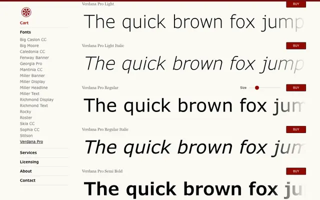
Matthew Carter's landmark screen typeface, extended by David Berlow and David Jonathan Ross into a 20-style superfamily with condensed widths and Latin, Cyrillic and Greek support.
About
Originally drawn by Matthew Carter for Microsoft with hinting by Tom Rickner, Verdana was engineered for clarity at small sizes on low-resolution screens, using a large x-height, wide proportions and open apertures. The Pro expansion adds Light and Black weights, matching italics and a full Condensed subfamily, bringing the total to 20 styles. Coverage across Latin, Cyrillic and Greek makes it workable across a broad range of publishing contexts, in print as well as on screen.
Classification
Verdana was designed specifically for screen legibility, with wide proportions, large x-height, generous letter-spacing and open apertures characteristic of humanist sans-serif design. The Pro expansion adds condensed widths and additional weights while retaining the original's screen-optimised humanist structure.