Stilson
Carter & Cone · Matthew Carter, Richard Lipton, Jill Pichotta, Dyana Weissman · 1997
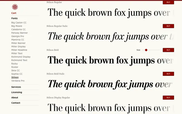
Matthew Carter's headline serif designed for The Washington Post in 1997, later extended with Display and Display Condensed subfamilies for broader editorial use.
About
Originally drawn for The Washington Post's headlines in 1997, Stilson has distinguished the paper's typography for over two decades. In 2009, Richard Lipton, Jill Pichotta and Dyana Weissman expanded the family with Display and Display Condensed cuts suited to larger settings, bringing the total to 12 styles across three subfamilies. Each subfamily is offered in Regular, Italic, Bold and Bold Italic.
Classification
A newspaper serif with the upright structure and moderate contrast typical of transitional designs, developed specifically for headline use at The Washington Post. The Display and Display Condensed subfamilies extend the original text cut for larger settings.