Roster
Carter & Cone · Matthew Carter, Jesse Ragan
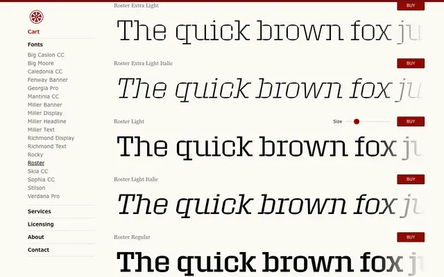
A 60-style slab serif superfamily by Matthew Carter and Jesse Ragan, built around the visual tension of squared inner counters set within large, curved rectangular outer forms.
About
Roster spans six weights and five widths — Standard, Narrow, Condensed, Compressed and Expanded — each with matching italics, totalling 60 styles. The defining characteristic is the contrast between rounded exterior silhouettes and chisel-cut counters, a relationship subtle enough to function at text sizes but most effective at display scale. The design rewards going large, where the sculptural quality of the letterforms becomes fully apparent.
Classification
A slab serif display family defined by the tension between rounded outer forms and squared, chisel-cut inner counters. The geometric construction and heavy slab serifs place it firmly in the geometric slab tradition, though the distinctive counter treatment gives it an unusually sculptural quality.