Miller Display
Carter & Cone · Matthew Carter, Richard Lipton, Jill Pichotta, Tobias Frere-Jones, Cyrus Highsmith
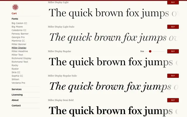
Matthew Carter's display-weight Scotch Roman, sharpened for headline and pull-quote use across print and screen, produced collaboratively with Lipton, Pichotta, Frere-Jones and Highsmith.
About
Miller Display revives the 19th-century Scotch Roman tradition with heightened contrast and crisper serifs calibrated for large-scale settings. Four weights with matching italics cover Light through Bold, making it suited to editorial hierarchies from fashion to financial publishing. The family is part of the broader Miller series, developed across multiple collaborators over successive stages.
Classification
A display-optimised Scotch Roman with sharpened serifs and enhanced contrast characteristic of 19th-century Scottish type traditions, designed for use at headline sizes where its high contrast and refined details read with particular clarity.