Georgia Pro
Carter & Cone · Matthew Carter, Steve Matteson, Tom Rickner · 1996
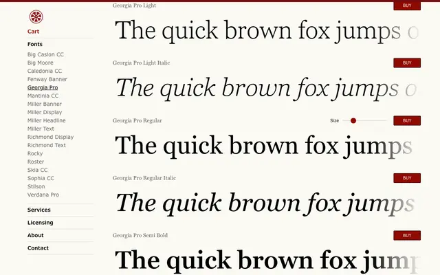
An expanded commercial release of Matthew Carter's 1996 screen serif, extended by Steve Matteson with five weights, a condensed width and small caps across 20 styles.
About
Originally designed for Microsoft in 1996 with pixel-grid clarity in mind, Georgia Pro builds on that foundation with Light and Black extremes flanking the original weight range, plus a full Condensed subfamily. Steve Matteson contributed the new weights and widths, with hinting by Tom Rickner ensuring screen rendering remains reliable across sizes. Multiple figure sets and small caps make it considerably more versatile than the ubiquitous system font from which it descends.
Classification
Georgia was designed as a screen-optimised transitional serif with generous x-height and open counters. Georgia Pro extends the original with additional weights, condensed widths and small caps, retaining the sturdy, high-contrast letterforms suited to both screen and print use.