Fenway Banner
Carter & Cone · Matthew Carter
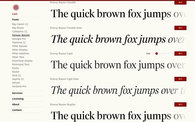
Matthew Carter's neoclassical serif, originally commissioned by Sports Illustrated, available in four widths and five weights with italics across 40 styles plus variable fonts.
About
Designed for rigorous publication work, Fenway Banner combines strong typographic colour with excellent copyfit across its four widths — Standard, Compressed, Extra Condensed and Condensed. The romans are drawn to hold weight at text sizes, while the italics are kept deliberately economic, making the family well suited to both book typography and high-density magazine layouts. Variable font support extends its flexibility further.
Classification
A neoclassical serif with strong stroke contrast and economic italics, originally commissioned for Sports Illustrated and suited to high-density publication work. Its four widths and variable format place it firmly in the tradition of versatile text serifs designed for demanding editorial environments.