Caledonia CC
Carter & Cone · Matthew Carter
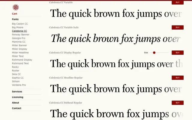
Matthew Carter's redrawing of Dwiggins' Caledonia for editorial use, offered in four optical sizes with matching italics and variable font files included.
About
Originally adapted from Linotype's 9-point drawings for Time magazine, Caledonia CC preserves the refined stroke contrast, sturdy rhythm and typographic clarity of the Scotch Roman tradition. The four optical sizes – Display, Headline, Subhead and Text – each compensate for the specific conditions of their intended setting, from large headline use to close body text. Variable fonts covering the full optical size axis are included free with family purchases.
Classification
A Scotch Roman revival derived from W.A. Dwiggins' Caledonia, itself a reworking of the sturdy, high-contrast Scottish-style serifs of the 19th century. The four optical sizes – Display, Headline, Subhead and Text – are characteristic of finely tuned editorial serif families designed for varied reading conditions.