 MegaMegaTypeType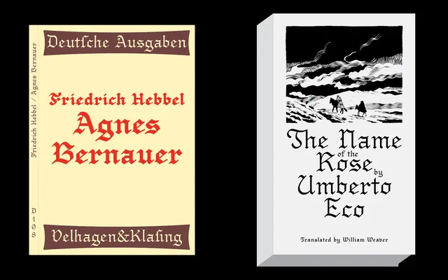
A five-weight Fraktur designed to preserve the character of historical blackletter while replacing its least legible letterforms with shapes more accessible to contemporary readers.
About
Drawn initially with a calligraphy marker and then digitised, Young Fraktur references Gutenberg's Textura, Schwabacher, Fette Fraktur and Old English as its primary sources. The designer has specifically addressed the historically ambiguous characters — A, G, H, I, J, K, N and Z among them — substituting more readable forms without sacrificing the blackletter spirit. Five weights from Light to Bold give designers control over emphasis and hierarchy, which is uncommon in digitised Gothic typefaces.
Classification
A contemporary Fraktur typeface drawing on the blackletter tradition, specifically referencing Gutenberg's Textura, Schwabacher and Fette Fraktur. The designer has modernised historically problematic letterforms to improve legibility while retaining the blackletter structure.